
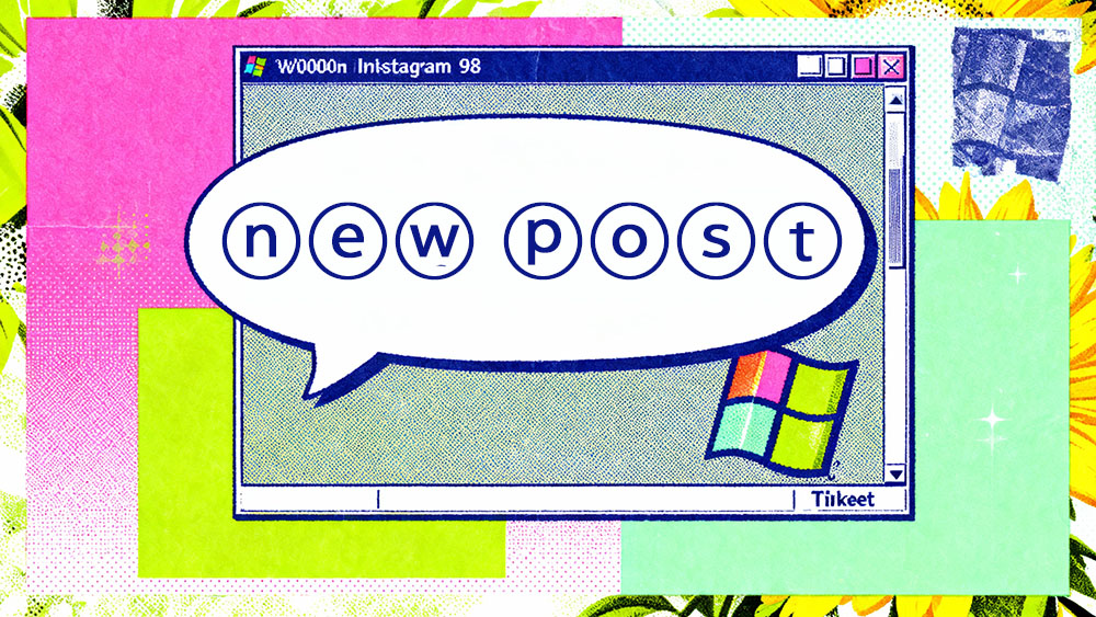
The Return of Y2K Aesthetic
Fashion is cyclical. Right now, we are deep in the revival of the late 90s and early 2000s design trends. It’s the era of Tamagotchis, translucent electronics, and bright, bubbly typography. In the web design world, this is manifesting as "Brutalism" and "Neo-Y2K".
Bubble text (ⓣⓗⓞⓢⓔ ⓛⓔⓣⓣⓔⓡⓢ ⓘⓝ ⓒⓘⓡⓒⓛⓔⓢ) fits perfectly into this vibe. It’s nostalgic. It’s playful. It reminds us of passing notes in class or MSN Messenger screen names.
Where to Use It
Bubble text is a display font. It is decorative. It is absolutely not for reading.
Social Media Bios: This is the most common use case. If you are a Gen Z brand or an influencer with a playful vibe, writing your main keywords in bubble text sets the tone immediately. It says "I don't take myself too seriously."
Bullet Points: You can use single bubble letters as stylized bullet points or list markers.
Ⓐ Step one
Ⓑ Step two
Ⓒ Step three
This looks surprisingly clean and is a great way to spice up a plain text list on Facebook or in a YouTube description.
Variations: White vs. Black
Most bubble text generators offer two main styles:
1. White bubbles: ⓣⓔⓧⓣ
2. Black bubbles: 🅣🅔🅧🅣
The black bubbles (Negative Circled Latin) are much heavier. They carry a lot of visual weight. They work well for short, punchy words like "NEW" or "SALE". The white bubbles are lighter and airier, better for longer phrases.
The Readability Trade-off
Let’s be honest: bubble text is annoying to read in long bursts. The circles around the letters eliminate the natural shape of the word. Our brains have to work harder to decipher each character individually rather than recognizing the word as a whole.
Use it for effect. Use it for a header. Use it for a name. Never use it for the body of your message. If your user has to squint to read your update, they will just keep scrolling. Design is about communication first, aesthetics second.