
LinkedIn: The Professional First Impression
LinkedIn is the world's largest professional network. Your profile isn't just a resume; it's a landing page for recruiters, clients, and partners. The most critical element of this landing page is your **Headline**—the line of text right under your name. Most people stick to the default: "Job Title at Company."
But you aren't "most people." To stand out in a sea of standard profiles, you can use **Unicode fonts** to add weight, style, and structure to your headline. Used correctly, this can elevate your personal brand from "employee" to "industry leader."
Why Customize Your Headline?
Differentiation in Search Results
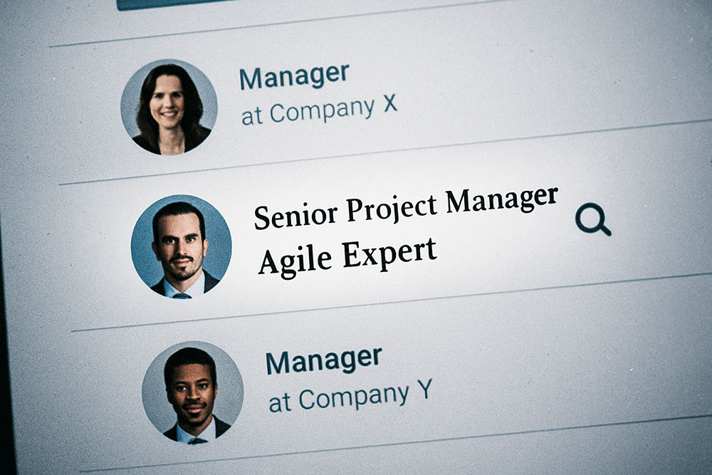
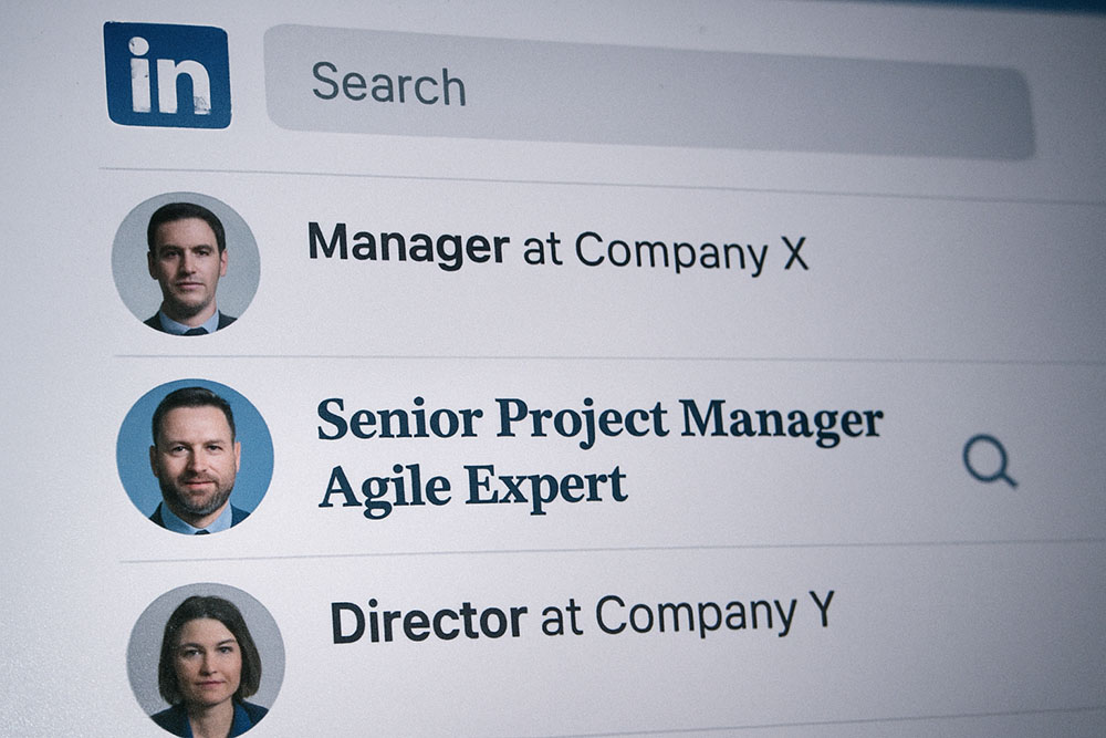
When a recruiter searches for "Project Manager," they see a list of hundreds of names. A headline that uses a 𝐒𝐞𝐫𝐢𝐟 𝐁𝐨𝐥𝐝 font for the job title immediately catches the eye amidst the plain text list. It signals creativity and attention to detail—traits highly valued in many industries.
Structuring Information
A good headline often contains multiple value propositions. For example: "Senior Developer | Python Expert | Open to Work." Using different font styles can help separate these sections visually. You might use Bold for your primary role and Italics for your soft skills.
Safe Fonts for LinkedIn
Not all Unicode styles are appropriate for a professional setting. While "Bubble Text" or "Glitch Text" might work for a gaming YouTuber, they look unprofessional on a LinkedIn profile. Here are the "Safe" styles to use:
1. Mathematical Bold (Sans-Serif)
This looks like a thicker version of the standard LinkedIn font. It is subtle and clean. Use it for your primary job title.
Example: 𝐏𝐫𝐨𝐝𝐮𝐜𝐭 𝐌𝐚𝐧𝐚𝐠𝐞𝐫
2. Mathematical Serif
This looks like Times New Roman. It implies authority, tradition, and academic rigor. Great for lawyers, professors, or writers.
Example: 𝐸𝑑𝑖𝑡𝑜𝑟 𝑖𝑛 𝐶ℎ𝑖𝑒𝑓
3. Small Caps
As mentioned in our previous articles, small caps look incredibly professional. They are excellent for listing skills or certifications.
Example: ᴘᴍᴘ ᴄᴇʀᴛɪғɪᴇᴅ | ᴀɢɪʟᴇ ᴄᴏᴀᴄʜ
The ATS Warning (Crucial!)
Applicant Tracking Systems
This is the most important part of this guide. **Do not write your entire headline in Unicode.** Many Applicant Tracking Systems (ATS) and LinkedIn's own search algorithm parse text strictly. If you write "𝐏𝐫𝐨𝐣𝐞𝐜𝐭 𝐌𝐚𝐧𝐚𝐠𝐞𝐫" (Unicode) instead of "Project Manager" (ASCII), the algorithm might not recognize the keywords.
The Hybrid Approach
The solution is the Hybrid Approach. Keep your critical keywords in plain text, and use Unicode for the connecting words, dividers, or secondary emphasis.
Bad: 𝐌𝐚𝐫𝐤𝐞𝐭𝐢𝐧𝐠 𝐃𝐢𝐫𝐞𝐜𝐭𝐨𝐫 (Hard to search)
Good: Marketing Director ǀ 𝘏𝘦𝘭𝘱𝘪𝘯𝘨 𝘉𝘳𝘢𝘯𝘥𝘴 𝘎𝘳𝘰𝘸 (Searchable title + Styled slogan)
Alternatively, write the searchable term first in plain text, then repeat or elaborate using styled text.
Step-by-Step Implementation
1. Define Your Value Proposition
Draft your headline. "Data Scientist specializing in AI and Machine Learning."
2. Select Elements to Style
Let's style the specialization to separate it from the job title. "Data Scientist | 𝒔𝒑𝒆𝒄𝒊𝒂𝒍𝒊𝒛𝒊𝒏𝒈 𝒊𝒏 𝑨𝑰 & 𝑴𝑳"
3. Generate and Paste
Use our Unicode Text Converter. Select the "Script" or "Italic" option. Copy the text. Go to your LinkedIn profile, click the pencil icon next to your profile picture, and paste the text into the Headline field.
Beyond the Headline: The "About" Section
Your "About" summary is often a wall of text. Use Unicode bolding to create subheaders within the summary.
MY EXPERIENCE
[Text here...]
MY SKILLS
[Text here...]
This makes your profile skimmable for busy recruiters who spend an average of 6 seconds looking at a profile.
Conclusion
LinkedIn is a professional space, but that doesn't mean it has to be boring. By intelligently using Unicode fonts, you can improve the readability and aesthetics of your profile. Just remember the Golden Rule: **Functionality first, style second.** Ensure your profile remains searchable, then dress it up for success.