
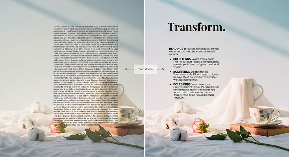
The Wall of Text Problem
The internet is a busy place. If you post a "Wall of Text" a solid block of gray paragraph with no breaks people will scroll past it. Our brains are lazy. We want to know if something is worth reading before we commit.
You don't need to be a graphic designer to fix this. You just need to understand visual hierarchy.
The 3-Second Scan
Imagine you are writing a caption for a product launch.
Boring version: "We are launching our new summer collection today. It features breathable fabrics and bright colors. Click the link to shop now."
It’s flat. It’s monotonous.
Bold version: "We are launching our NEW SUMMER COLLECTION today. It features breathable fabrics and bright colors. Click the link to SHOP NOW."
See the difference? In the second version, a user scanning rapidly sees: SUMMER COLLECTION ... SHOP NOW. They get the message in 0.5 seconds. The formatting does the heavy lifting for them.
Don't Just Decorate, Direct
The goal isn't to make it look "pretty." The goal is to direct traffic. Use bold for the "What" (the main subject). Use italics for the "Why" (the emotion/benefit). Use clean, spaced-out text for the "How" (instructions).
Online text tools give you the ability to structure your plain text just like a magazine editor structures a page layout. You are taking raw data and turning it into information.