
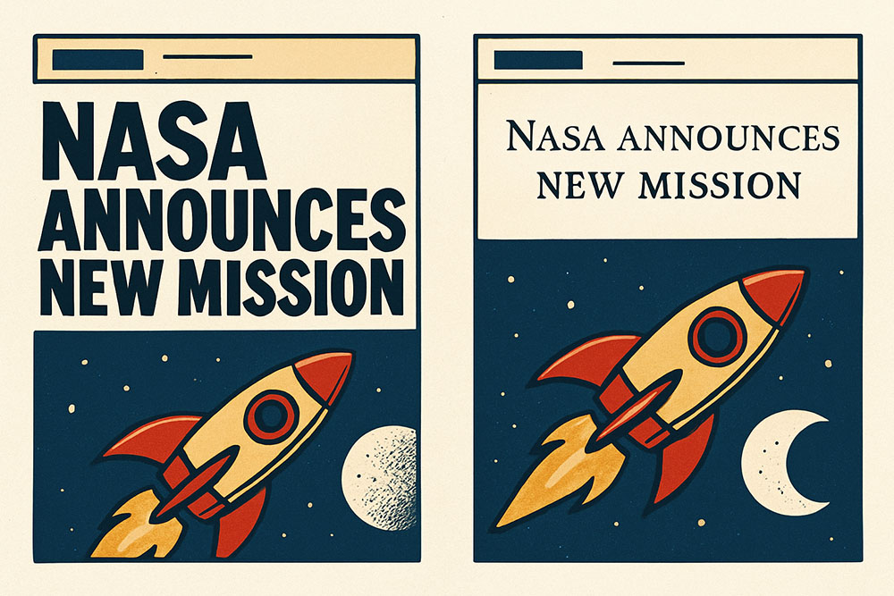
It's Not Just About Making Letters Smaller
There is a common misconception that small caps are just capital letters shrunk down to a smaller size. If you just take a standard font and reduce the font size of uppercase letters, the strokes get too thin and the proportions look wrong. Real small caps are designed explicitly to match the weight and width of lowercase letters while keeping the structure of capitals.
In web design, details matter. Using small caps correctly can separate a professional-looking site from an amateur one. They are a subtle tool, but when you use them right, they create a beautiful, even texture on the page that standard capitalization just can't achieve.
The Golden Rule: Acronyms and Abbreviations
The best place to use small caps is for acronyms. Think about it. When you write "NASA" or "FBI" in the middle of a sentence, those big blocky letters scream for attention. They break the visual flow of the reading experience. It feels like a hiccup in the text.
By switching to small caps (ɴᴀsᴀ or ғʙɪ), you keep the height consistent with the surrounding lowercase letters (like x-height). The acronym is still readable, but it doesn't dominate the line. It blends in. This is why typography snobs love them—they maintain the "color" of the text block.
Headers and Subheads
Another great spot for this style is in your subheaders or navigation menus. A navigation bar written in standard uppercase can look a bit aggressive, like you are shouting "HOME ABOUT CONTACT" at the user. Lowercase might feel too casual.
Small caps hit that sweet spot in the middle. They feel formal and grounded but not loud. They define a clear hierarchy without needing to make the font size huge. It's an elegant solution for secondary headers, specifically the ones above a main headline (called kickers).
When to Avoid Them
Don't write long paragraphs in small caps. Just don't do it. It is incredibly hard to read. Our eyes rely on the ascenders (the tall parts of h, k, l) and descenders (the tail of g, p, y) to recognize word shapes. Small caps flatten everything into a rectangle. Reading a whole blog post in this style would be a headache for your users.
Also, be careful with proper nouns if you are using a Unicode generator instead of CSS. While CSS handles the conversion perfectly, Unicode characters are separate symbols. Screen readers generally handle them okay these days, but it's safer to use them for stylistic elements rather than essential data.