
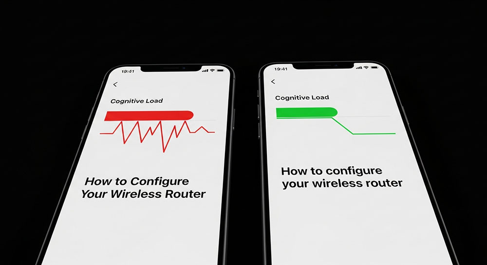
The Screen Real Estate Battle
We read differently on phones than we do on paper. On a mobile device, the screen is narrow. Glare is an issue. Distractions are everywhere. Users are often walking or commuting while reading. In this hostile environment, clarity is king. And in the battle for clarity, Sentence Case is the undisputed champion.
The Science of Scanning
When humans read, we don't look at every letter. We recognize the shape of words (bouma shape).
Consider the word: reading.
In lowercase, it has ascenders (d) and descenders (g). It has a distinct shape contour.
In Title Case: Reading. The capital R changes the shape.
In All Caps: READING. It is a rectangular block.
Sentence case preserves the natural shape of words that our brains have spent years memorizing. This allows for "saccadic" reading where the eye jumps rapidly across the line. Title Case introduces visual noise. Every capital letter is a signal that says "Start of new concept" or "Proper Noun." When every word is capitalized, the brain gets false signals, slowing down the processing speed.
The "Long Headline" Problem on Mobile
On a desktop monitor, a headline might fit on one line.
"How To Configure Your Wireless Router Settings"
On a mobile phone, that header wraps to three lines:
How To Configure
Your Wireless
Router Settings
In Title Case, this looks messy. The capitals are scattered everywhere. It looks like a list of proper nouns.
In Sentence Case:
How to configure
your wireless
router settings
It flows down the page. It clearly looks like one cohesive thought that happens to be broken up. It is less intimidating to the user.
Differentiation from Proper Nouns
In the tech world, we use a lot of proper nouns (iPhone, Android, Bluetooth, Python).
If you use Title Case, proper nouns get lost.
"New Support For Python In The Latest Update"
Is "Support" a brand name? Is "Latest Update" a specific feature name? You can't tell.
If you use Sentence Case:
"New support for Python in the latest update"
Now, "Python" pops out. It is the only capitalized word besides the start. The user instantly scans and sees the important keyword. Sentence case acts as a natural highlighter for the things that actually matter (brands, names, places).
Accessibility Matters
For users with dyslexia or cognitive impairments, Title Case can be significantly harder to decipher. The inconsistency of capitalization breaks the pattern recognition needed for fluent reading. Sentence case is the most accessible, inclusive format because it mirrors spoken language structure.
Why Apps Are Switching
Look at the evolution of iOS. In early versions, everything was Title Case. Today, Apple Mail says "Check for new messages" (Sentence Case). Settings say "General," "Control center," "Display and brightness."
They switched because it reduces visual clutter. An interface is already full of icons, lines, and images. Text should not compete for attention; it should deliver information transparently. If you are designing for mobile, leave the vanity of Title Case at the door and optimize for the user's brain.